 Color psychology is one of the most interesting parts in blog design. I love it. Choosing the right colors for your blog is an essential step for your branding. If you’re struggling with your blog, your colors could be one of the places for improvement or complete overhaul!
Every color has its own personality. If you don’t think it matters to websites and blogs, take a second right now and imagine Facebook. You see it in your head? Yep. Except I want you to imagine an orange Facebook.
The effect isn’t the same, is it? Both men and women don’t like orange much. You won’t see many blogs or websites using that color.
Color psychology isn’t new. It goes back to the ancient civilizations, who segregated their classes with color. Only royals could use purple- and to this day, purple is associated with sophistication. Hence, if you go to a beauty or beauty product website, it’s purple.
Why and Where Color Matters
It takes a customer 90 seconds to judge a product. And as numerous commercials of blind tests prove, people are visual creatures. In that 90 seconds of judgment, 60-90% comes from the product’s color alone. This is from the study, Impact of color on marketing.
Your blog should take advantage of that color bias. Color is critical to:
- Conversion - The colors you choose should pop and attract your reader. Men and women both like the colors blue and green. Now you know why most sign-up/subscribe/purchase buttons are in blue or green.
- Attracting your audience - Your blog colors assure your readers that they’re in the right place. This is their hangout spot. This is for them.
- Brand personality - Trustworthiness, happiness, energy, power- depending on your niche, you’d want your blog to represent certain values and qualities. Your blog colors are the primary communicators of those values and qualities!
- Readability - Color contrast, complementary and vibrancy makes your blog easy and even attractive to look at and read. It also makes certain areas pop. Which places in your landing page has to draw the eye?
- Accessibility - Hyperlinks are blue by default because even the color-blind can distinguish it. But accessibility is not just for color-blindness, but for all devices. If you depend on color for readability, your design needs changing.
Knowing that, you probably already guessed where colors matter:
- Your blog’s overall theme, background and foreground
- The text
- The navigation bar
- The headings
- Call-to-Action buttons
- List items/features
How to Choose The Right Colors for Branding, Conversion and Eye-friendliness
Target your audience through color.
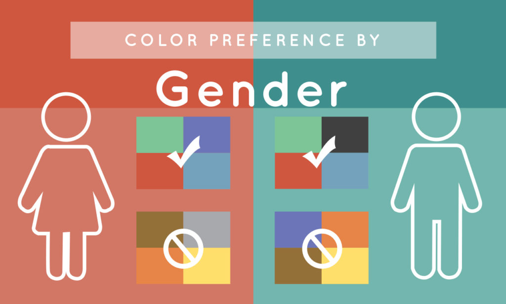
If your target audience are women, stay with blue, green, purple and other derivative shades like pinks.
If your target audience are men, stay with blue, green, black and other derivative shades including gray- most techie and car websites are in silver, and black!
Understand the psychology of color and represent your blog accordingly.
This survey from Joe Hallock has a breakdown of what colors people associate with certain qualities.
Blue denotes sincerity, loyalty, trust, reliability. The hallmarks of friendship and partnership. That’s why Facebook, PayPal and most banks are blue.
Use yellow sparingly, if at all. It’s more effective for callouts. Wet-floor warnings are in yellow!
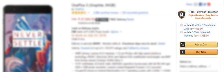
Orange creates urgency. It’s better than yellow for callouts. Amazon uses orange.
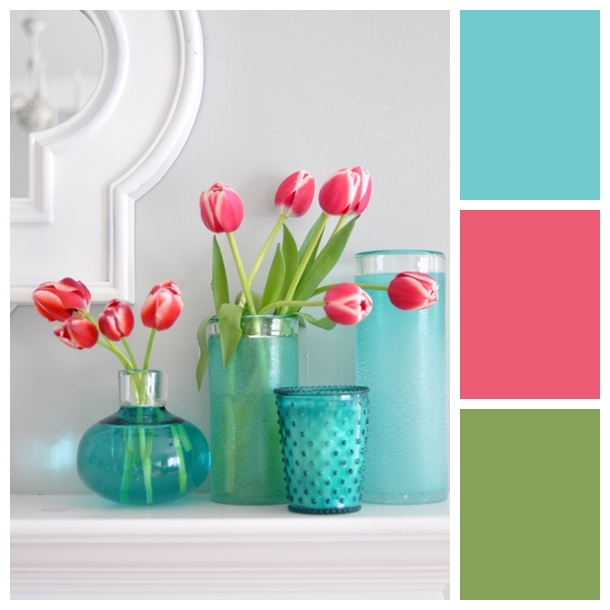
Green is for earthiness and the outdoors, and creativity. Travel, gardening and DIY blogs do well with green.
Green also looks good isolated. It doesn’t hurt the eyes even if it’s the only pop of color on the page! This makes it ideal as the call-to-action button. It’s called the von Restorff effect- people remember things that stand out.
![]()
Red is for romance- and you also see it in horror movies and ghost sites. It denotes strength, warmth and wisdom. This is a very powerful color- I’m not alone in using it for my headings.
Pink is for sensitivity and empathy. It’s very feminine because it’s connected to all the soothing and nurturing aspects of motherhood.
Black is sophistication, high quality and luxury- and value at the same time. If you go to Amazon and Sephora, and most e-commerce and high-end brands in fashion or in automotives and technology, they are predominantly black, or use black for their announcement banners.
White- looks good, whether or not you think it’s a color. It’s peaceful and relaxing, and remains the best background color for text.
Look at palettes for ideas- or make a palette yourself!
For example, you have a gardening and DIY blog. That doesn’t mean a solid green blog. You’d need one or two other complementary colors.
Or you probably have a gorgeous photo and you’re using it as a banner header. You can match your blog to it by building a palette from that photo. Coolors.co and Paletton create palettes, or you can go straight to Pinterest!
I love this guide from Design Your Own Blog on choosing colors to evoke feelings.
Never use similar brightness values between your colors and the color base of your website. This causes the text to vibrate and can lead to watery eyes.
Remember contrast.
Contrast makes all the difference in getting your content read. This is the reason a white background and black font color remains the best for blog text. What about your banner announcements and other designs?
To test whether your chosen colors have a good contrast, turn them into greyscale.
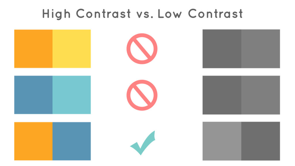
Choose high contrast for your most important content, and low and medium contrast in the rest of the page helps the ones in high contrast stand out. They work together. If everything is in high contrast, nothing would pop.
High contrast also helps a lot with color-blindness. Your design remains readable and enjoyable.
Find a balance- everything should be easy to read, and your most important bits should stand out.
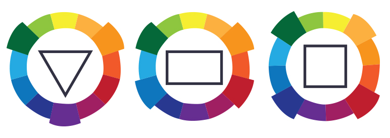
Remember complementary colors.
If you’ll look at my website, I have two main colors- red and this soft aquamarine. Red is a primary color- and its complementary color is green. I chose a shade of green.
The best color palettes are a mix of complementary colors.
But keep it simple.
Avoid too many colors and too complicated mixes of different hues and shades. People prefer a simple layout with two to three of their favorite colors.
Use triangle, rectangle or square colors. Take a color wheel and choose colors in these formations. You’d get a lovely combo every time, but to keep it simple, pick ONE dominant color, and the rest are accents.
Draw attention to your nav bar and headings through color saturation or color contrast. Choose urgency (orange, red) or isolation (green, blue) for your calls to action.
Test your colors. Test your buttons in different colors. See which converts. That’s the only way to be sure you’ve got the best color.
What were your chosen colors from the beginning, and did you stick with them as you went forward with your blog design? What colors do you like best, and which did their job?
Please, share in the comments!


Hi Tanya,
I am actually re-designing my blog at the moment, so this has come at a great time!
Blue has always been part of my color scheme and is likely to play a bigger role in the new design. I think blue is a great color and I chose it for the trust factor, when you are new to the scene trust is really important!
Any ways to add trust are a must…
Thanks for this!
Joe
Joe, your design looks amazing! Great work!
Do these colors need to be in the images you use on your blog, too? It’s hard to find images that use the colors every time & in DIY projects it’s hard to create projects with mainly those colors…
Hi, Sarah - great question! One way that you can incorporate your colors into your images in in the text that you add to them. If you can find images in the same color range that you’re using on your blog, that’s great - otherwise adding color blocks behind text and coloring the text you use in the images can help!